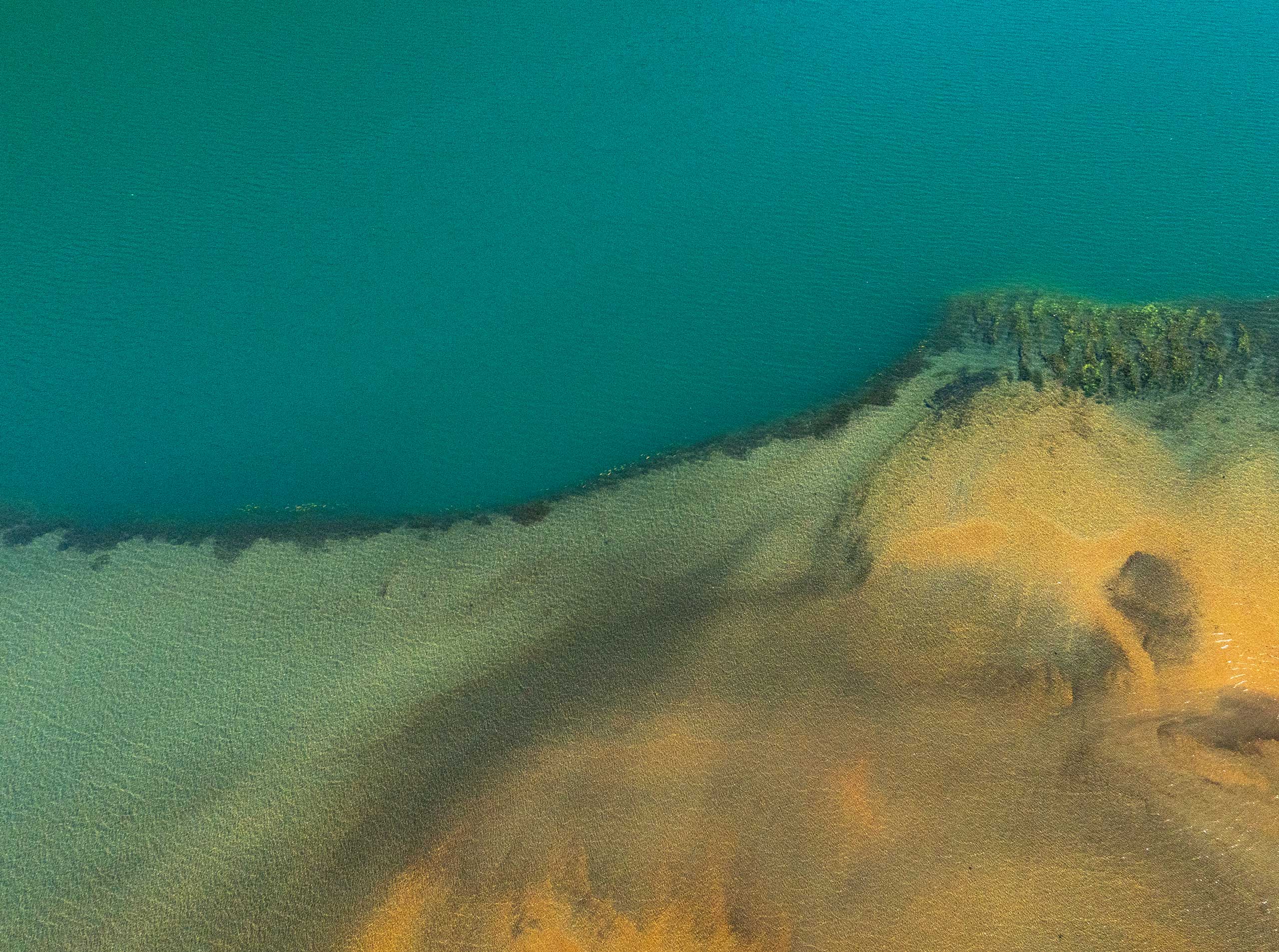
Graphic Explorations for the Visual Identity of the Sanctuary and the Foundation →
The different tones of blues represent the valuable water resources, glaciers, lakes, rivers, and wetlands found in the area, while the terracotta, orange, and green hues allude to the soil, flora, and fauna that are being protected in the sanctuary.
The logo itself functions as a symbol that can be interpreted from different angles: as a puye, a leaf, a branch, a tree, roots, or rivers. The various possible interpretations give a hint of the valuable and complex ecosystem present in this area.
